Design System
Contents
The design system for arXiv is dedicated to establishing and continuously improving the visual interface and branding assets for arXiv.
Design for NG user interface features uses a light touch on previous design decisions to provide a more modern look to arXiv. This means thoughtful layouts, meaningful labels and headers, higher color contrast, more white space, larger and more hierarchical typography. Accessibility and universal design principles are the drivers for key decisions when making a global change.
Note
This is a living document to guide current development using consistent design and display patterns. It is intended to be updated periodically as the design evolves incrementally over time with the progression of NG releases and milestones.
Notes About Accessibility
All new interfaces for NG should meet WCAG 2.0 standards, extending to WCAG 2.1 when possible.
Whenever possible, use the design system color defaults as intended. If a
non-compliant element is discovered or a new element needs to be added, it
can then be consistent across the entire application. For example, errors use
.is-danger, warnings use .is-warning, links use .is-link, and
success messages use .is-success.
To help meet the logical presentation and comprehension goals of WCAG 2.0, summaries and descriptions of page functions in page titles or at the top of page content help screen readers (and all humans) orient the context of each page. In addition, both programmatic and visual presentation of any page’s content must flow in a logical manner.
Bulma - CSS Framework
arXiv stylesheets override Bulma’s defaults only when necessary to create a style unique to arXiv and consistent with our design philosophy. If a custom style needs to be created, consider whether one of Bulma’s helpers can be used or whether a global style or variable may need to be adjusted.
Many styles are derived from variables that have the power to make widespread global changes quickly, pertaining to color schemes, margins and padding, typography, and borders.
Overrides
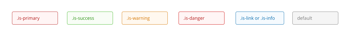
Note that some of the colors displayed in Bulma’s documentation have been overridden in arXivstyle: primary, success, warning, danger, link, info, grey, and grey-lighter.
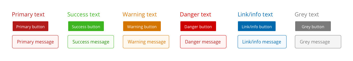
Fig. 30 Color samples
Note
Link and info are the same blue. Primary and danger are slightly different, but because of the similarity in color, primary is rarely used as a design element outside of the header. Grey and grey-lighter are adjusted for color contrast to pass accessibility criteria. The grey button is illustrated here for an example of color, but this style is not used specifically as a button in arXivStyle. The default button is a lighter grey with dark text and outline.
What to do when the system doesn’t have what you want
If no combination of existing styles can be used to achieve a desired outcome, a custom style may be created within the feature’s repository. However, it is much better to reuse existing classes than to create new ones to preserve design consistency throughout the application.
If an existing class can be applied to elements, but doesn’t look good in context, it is recommended to consider a redesign proposal for that element rather than to create a custom class for specific purposes.
Any custom style may be considered as a candidate for future base/global design change - especially if there is a great deal of repetition.
Helpers
Bulma’s default helpers are numerous and powerful. They make it easy to get what you want - but can be misused or overused in place of more appropriate markup, particularly in the case of font size overrides.
Customized Helpers
arXiv’s base style sheets extend Bulma’s helper idea:
Class |
Description |
|---|---|
|
changes font-family to Lucida Grande, monospace font stack |
|
align-items: baseline (used in flex) |
|
sets margin: auto on top and bottom |
|
accessibility class used to visually hide a label from a screen without removing it from the document flow (may be superseded by .sr-only default helper class) |
|
sets max-width to 8rem, designed for input fields |
|
sets max-width to 25rem, designed for input fields |
|
sets margin-left to 2em, designed for file trees |
|
sets 4rem margin to top and bottom |
|
sets 6rem margin to left and right (4rem for tablet, 0 for mobile) |
Element Examples
Titles and Headlines
Syntax
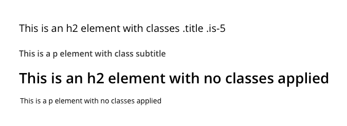
<h2 class="title is-5">This is an h2 element with classes .title .is-5</h2>
<p class="subtitle">This is a p element with class .subtitle</p>
<h2>This is an h2 element with no classes applied</h2>
<p>This is a p element with no classes applied</p>
Notice how the margins and styling changes when modifying classes are applied:
Accessibility
Document structure needs to be maintained in logical reading order and hierarchy, regardless of display. It is possible to use the title and size style overrides to create visual hierarchies that are not programmatically consistent. Try to avoid this.
The goal is to have a well structured HTML document that has programmatic comprehensibility and a logical hierarchy, while maintaining visual comprehensibility and hierarchy.
Note
Avoid using <div> elements for presentation text without a text
context (p, h2, h3, li) if possible. This doesn’t give any
programmatic context for the text and may confuse screen readers or
other assistive technologies.
Links
Syntax
<a href="#">Contextually appropriate link text</a> allows the purpose of a
link to be determined without following the link or hovering to see its
location.
A link can also have <a href="#" class="button" title="Button text">button
styling</a>. Guidelines for determining purpose from link text apply.
Accessibility
Guidelines applying to links include:
context sensitive link text
using a means of identifying a link other than color alone (underline, background, border, etc)
useful title or name if contextually appropriate text is not possible
visible focus
if a link changes the page context, use an icon and aria-label (link opens in new tab) or (link sends email) to explain
Icons
Syntax
We use FontAwesome 4.7 (for now). Cheatsheet of all icons <https://fontawesome.com/v4.7.0/cheatsheet/> is available - use icons that are styled similarly to other icons used on the site.
Change the icon color with class .has-text-[colorname] and size with class .is-small, is-medium, is-large.
Information button: 
<span class="icon has-text-link"><i class="fa fa-info-circle"></i></span>
Help button: 
<span class="icon has-text-link"><i class="fa fa-question-circle"></i></span>
Warning triangle: 
<span class="icon has-text-danger"><i class="fa fa-warning"></i></span>
Twitter (note the label, this icon may appear without accompanying text): 
<span class="icon has-text-link"><i class="fa fa-twitter" aria-label="Twitter"></i></span>
Trash can: 
<span class="icon"><i class="fa fa-trash" aria-label="Delete"></i></span>
Down arrow (dropdown/expanded file tree): 
<span class="icon"><i class="fa fa-angle-down" aria-label="Expand list"></i></span>
Right arrow (collapsed file tree): 
<span class="icon"><i class="fa fa-angle-right" aria-label="Expand list"></i></span>
Up arrow (collapse, for More/Less): 
<span class="icon"><i class="fa fa-angle-up" aria-label="Collapse list"></i></span>
Accessibility
If an icon is decorative only, it must contain blank alt text/name or
aria-role=presentation. An icon is purely decorative if it is accompanied
by text that describes it, or if the text accompanying an icon means the same
on its own without the icon.
If an icon is functional (a button or link), the button or link must contain useful contextual language about the icon.
The helper class .hidden-label can be used when necessary to provide
context, especially labels or navigational orientation, for screen readers.
Messages and Notifications
When to use MESSAGE and when to use NOTIFICATION
Messages are small pieces of text that are generally intended to remain on the screen at all times. Example: help text
Notifications could be thought of as pieces of text that could be displayed as a modal, if we did that. Generally intended to have a function to dismiss or will otherwise disappear if the page is reloaded. Example: flashed error or confirmation text
Bulma’s default has different styling for messages and notifications; arXiv’s system overrides default notifications to look like messages without headers.
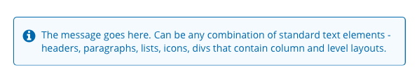
Message syntax
<div class="message is-info">
  <div class="message-body">
    <p><span class="icon has-text-link">
    <i class="fa fa-info-circle"></i></span>The message goes here. Can be any
    combination of standard text elements - headers, paragraphs, lists, icons,
    divs that contain column and level layouts.</p>
  </div>
</div>
Message with delete icon
<div class="message is-danger" role="alert">
  <div class="message-body">
    <button class="delete is-small is-pulled-right" value="Dismiss Message"></button>
    <div class="is-pulled-left">
      <span class="icon has-text-danger"><i class="fa fa-warning"></i></span>
    </div>
    <div class="content">
      <p>This is where an error message goes</p>
    </div>
  </div>
</div>

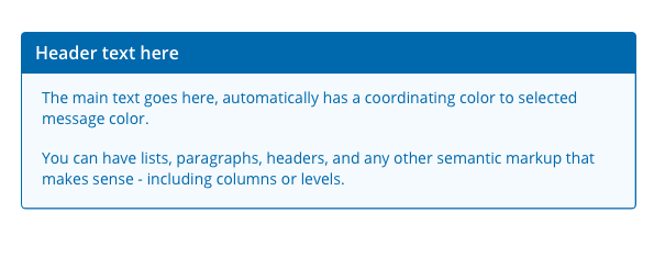
Message headlines
If a headline is desired on a message box, the syntax changes somewhat:
<div class="message is-link">
  <div class="message-header">
    <p class="has-text-white">Header text here</p>
  </div>
  <div class="message-body">
    <p>The main text goes here, automatically has a coordinating color to
    selected message color.</p>
    <p>You can have lists, paragraphs, headers, and any other semantic markup
    that makes sense - including columns or levels.</p>
  </div>
</div>
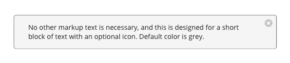
Notification syntax
<div class="notification" role="alert">
<button class="delete" name="Delete" value="Dismiss Notification"></button>
No other text markup is necessary, and this is designed for a short block of
text. Default color is grey.
</div>
Fields
Syntax - input, textarea, radio, checkbox, select
Fields are groups of controls, and the field/control class styling is used for
evenness of spacing. In general, a field contains a label, a control (input),
and an optional label. Sometimes it makes sense to group a control button in
a field - for example, a single input and submit button could be controls in the
same field - but generally a button would have its own field. field and
control classes are for layout purposes only and serve no semantic or
programmatic purpose, from an accessibility standpoint.
<div class="field">
  <label class="label">Can be visually hidden but must exist</label>
  <p class="help">This help text is optional</p>
  <div class="control">
   <input class="input" type="text">
  </div>
</div>
To attach fields together, use .has-addons on the field container.
<div class="field has-addons">
  <div class="control">
    <label for="myfield" class="hidden-label">Label for accessibility</label>
    <input class="input" name="myfield" type="text" placeholder="Text field">
  </div>
  <div class="control">
    <label for="nextfield" class="hidden-label">Attached dropdown</label>
    <div class="select">
      <select name="nextfield">
        <option>Only one option, pretty useless</option>
      </select>
    </div>
  </div>
</div>
Fieldsets
When two or more fields are grouped together by a common label, use a fieldset to add programmatic context and a label (either hidden or visible to sighted users). This may require careful crafting of fieldset and field labels.
The benefits to using fieldsets include the ability to highlight multiple fields for error location and the ability to refer programmatically to field groups as a single unit. Sometimes this is required to meet accessibility goals.
Examples:
Radio buttons that belong to a single question can generally use a fieldset.
Groups of checkboxes (example: subject/category search)
Anything you want to put an error box around in the event of a “please select one” type of error (license, authorship)
Errors
Best practices for accessibility involve:
Display brief error summary in page title (example: 2 errors on page - Add Metadata - Submit an Article)
Display list of errors in an alert box at the top of the page. Bonus points for adding links directly to those fields.
Display error message and icon/color coding directly next to field(s) that contain the error(s).
For each error, provide information or suggestions for how to fix the error.
Accessibility - other concerns
Don’t use radio buttons for binary yes/no - checkboxes are better
Radio buttons must have a default value
Display help and error messages ahead of their fields to give context for screen readers
Instructions for the form should be on every page
Labels and help text must be clearly written to provide context and useful instructions for all readers
Buttons
Actionable buttons in arXiv interfaces should follow common patterns to maintain expectations for a button’s action.
Colors
Use .is-link buttons for primary actions in main content areas.
Use default button style (no color class) for alternate or secondary actions.
For some special cases, a .is-success or .is-danger button might be
warranted, but these will be very rare.

Syntax
For buttons within forms:
<div class="field">
  <div class="control">
    <button class="button is-link" name="Save and Continue" value="save">Save and Continue</button>
  </div>
</div>
For buttons outside of forms that need to look like buttons:
<a class="button is-link" href="#link">Take Action</a>
Note that with a link as a button, margins and spacing will need attention to be consistent with other buttons. This case, using a link as a button, should be relatively rare within arXiv.
Accessibility
If a button does not have any text (submit buttons with default text can be
coded this way), be sure to provide a value="useful text" for screen readers
to announce.
Layout Examples
Level
Usage
When you want to keep a number of items vertically centered, but distributed
across the page evenly, use this. For mobile devices, the layout is
automatically shifted to columns. A single helper class .is-mobile can
prevent the vertical shift on mobile if needed. Especially useful for
great-looking navigation.
Level is currently used for arXiv-NG headers. https://bulma.io/documentation/layout/level/
Syntax
<div class="level">
  <div class="level-left">
    <div class="level-item">
      <p>This item will be on the left</p>
    </div>
    <div class="level-item">
      <p>This item will also be on the left</p>
    </div>
  </div>
  <div class="level-right">
    <div class="level-item">
      <p>This item will be on the right, and vertically centered with the
      items in level-left.</p>
    </div>
  </div>
</div>
For a horizontally AND vertically centered level, just leave out the
.level-left and .level-right classes.
<div class="level">
  <div class="level-item">1</div>
  <div class="level-item">2</div>
  <div class="level-item">3</div>
</div>
Columns
This layout device is for creating columns. Uses flexbox to provide responsive features and will automatically switch to vertical layout for mobile. Unlike level, this behavior can be adjusted for different breakpoints using helper classes.
Columns are used in the Advanced Search page and in the arXiv-NG footer. There is a lot of flexibility in columns, best illustrations and examples are in the Bulma documentation.
Syntax
A basic syntax for evenly-spaced columns would be:
<div class="columns">
  <div class="column">
    <p>This is within column 1</p>
  </div>
  <div class="column">
    <p>This is within column 2</p>
  </div>
  <div class="column">
    <p>For more columns, just keep adding column divs.</p>
  </div>
</div>
You can specify column widths, even creating columns that do not add up to a full page width:
<div class="columns">
  <div class="column is-half">
    <p>This column will only take up half the width of this page, but will
    still flex to full width on mobile devices.</p>
  </div>
</div>